13 Easy-to-Copy SaaS Homepage Conversion Hacks to Accelerate Signups I Learned From Growing Major Tech Like Yandex
Increasing your homepage conversion rate from existing traffic is a faster, easier way to grow monthly revenue than chasing new leads. Many SaaS companies focus on attracting visitors, but without an optimized homepage, they risk losing ideal prospects who might otherwise convert into paying customers.
Drawing from my experience leading growth for major brands like Yandex, Indeed.com’s largest competitor in Australia, and Fiscally, here are my 13 conversion rate optimizations you can implement immediately to accelerate your new user signup rates.
No need to take notes – a checklist for you with all the optimizations will be included at the end.
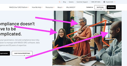
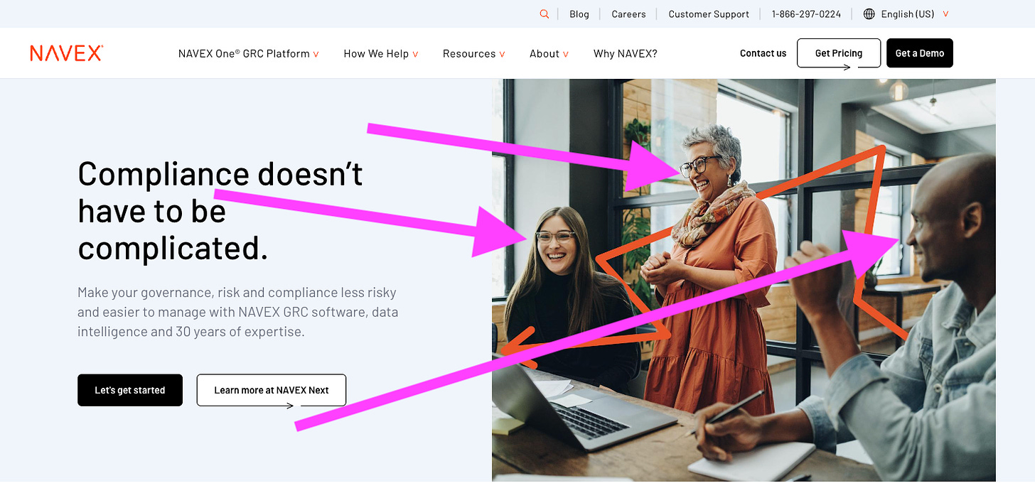
1. Your homepage should have personality and showcase real human faces
A homepage with personality and real faces humanizes your brand, creating a sense of trust with potential users. Homepages and landing pages with authentic photos of people feel more authentic and evoke more emotions, making your service much more relatable.
Here’s a great example of Navex using real human faces above the fold in their hero.
Source: Navex.com
2. Your hero section must include a clear and compelling value prop
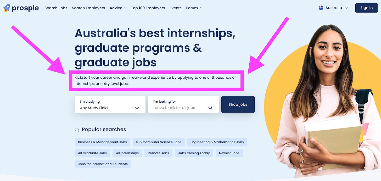
Your value proposition should be front and center, immediately telling users what makes your product worth their time. The simple way to think about your hero (above the fold) copy is to use the large, primary headline to explain the What, and the subcopy below it to explain the How.
Here’s a subcopy example that not only speaks directly to the two biggest pain points new grads face launching their careers - getting their foot in the door and gaining real world experience - but also explains how it works.
While I was leading growth at Prosple, we tested that exact copy against 11 other variations. The version you see there won out because it’s 1) clear, and 2) authentic. I know because I wrote it 😉
Source: www.au.prosple.com
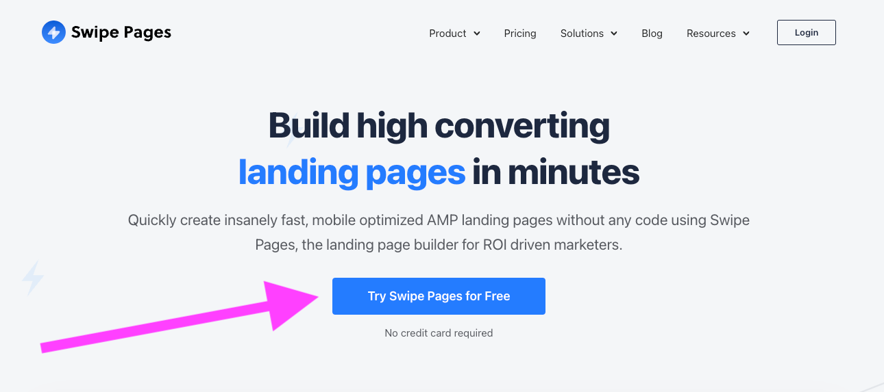
3. Your hero section includes a clear primary call to action (CTA)
Your CTA needs to be direct and action-oriented. Whether it’s “Sign Up Now” or “Start Free Trial,” the CTA should be impossible to miss. Swipe Pages has done an excellent job here making their CTA stand out visually. Plus, they make it clear that it’s free to sign up without any credit card required, making it even easier for fence sitters to click and sign up.
Source: Swipepages.com
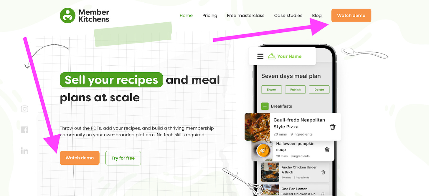
4. Your hero should also include a CTA to a product tour or demo
Offering a product demo right in the hero section can increase user engagement dramatically. SaaS companies that offer an immediate, clear path to a demo see a 30% higher conversion rate. It allows visitors to experience the value of your product right away without any guesswork.
Member Kitchens has gone all in making their demo their primary CTA, placing it both within their hero and as the main CTA in their navigation.
Source: memberkitchkens.com
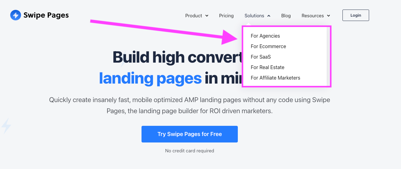
5. Navigation should include a path for different personas
Although multiple people like Italian food, that doesn’t mean they will all order pasta. In the same way, the website visitors might be similar but still have different needs. Your navigation should reflect that by guiding them down relevant paths to ensure they get the information they need.
Source: Swipepages.com
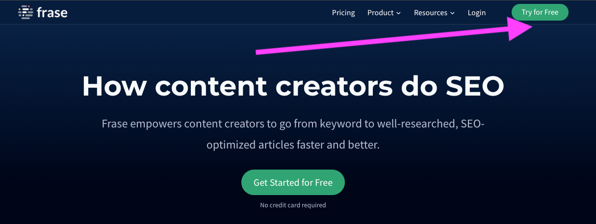
6. You navigation also needs a clear CTA
A clear CTA should be present in your navigation bar for users who are ready to act. This should be a primary CTA whose design is consistent with the design of the other primary CTAs throughout your page.
Source: Frase.io
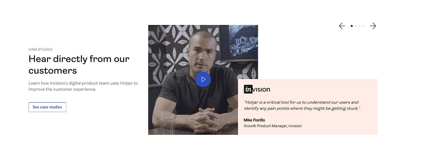
7. Add testimonials for social proof and trust
Including customer testimonials on your homepage builds credibility and reduces hesitation. It’s sort of the word-of-mouth marketing of the digital landscape.
Here are a few tips for including testimonials on your homepage:
Never show just 2 or 3 testimonials - people will think it’s the only three you have.
You can show a single, standalone testimonial, but make it stand out with lots of screen real estate to give it emphasis
Always include photos of the person who gave the testimonial
Source: Hotjar.com
8. Add brands you’ve worked with or use you
Showcasing the logos of well-known brands you’ve worked/partnered with or that use your tool is a great way to build more social proof. At Book Like A Boss where I ran growth and marketing, we showed off some companies that used us to manage their internal and external bookings on a horizontal, rotating slider.
Source: blab.co
9. Include and display your key features
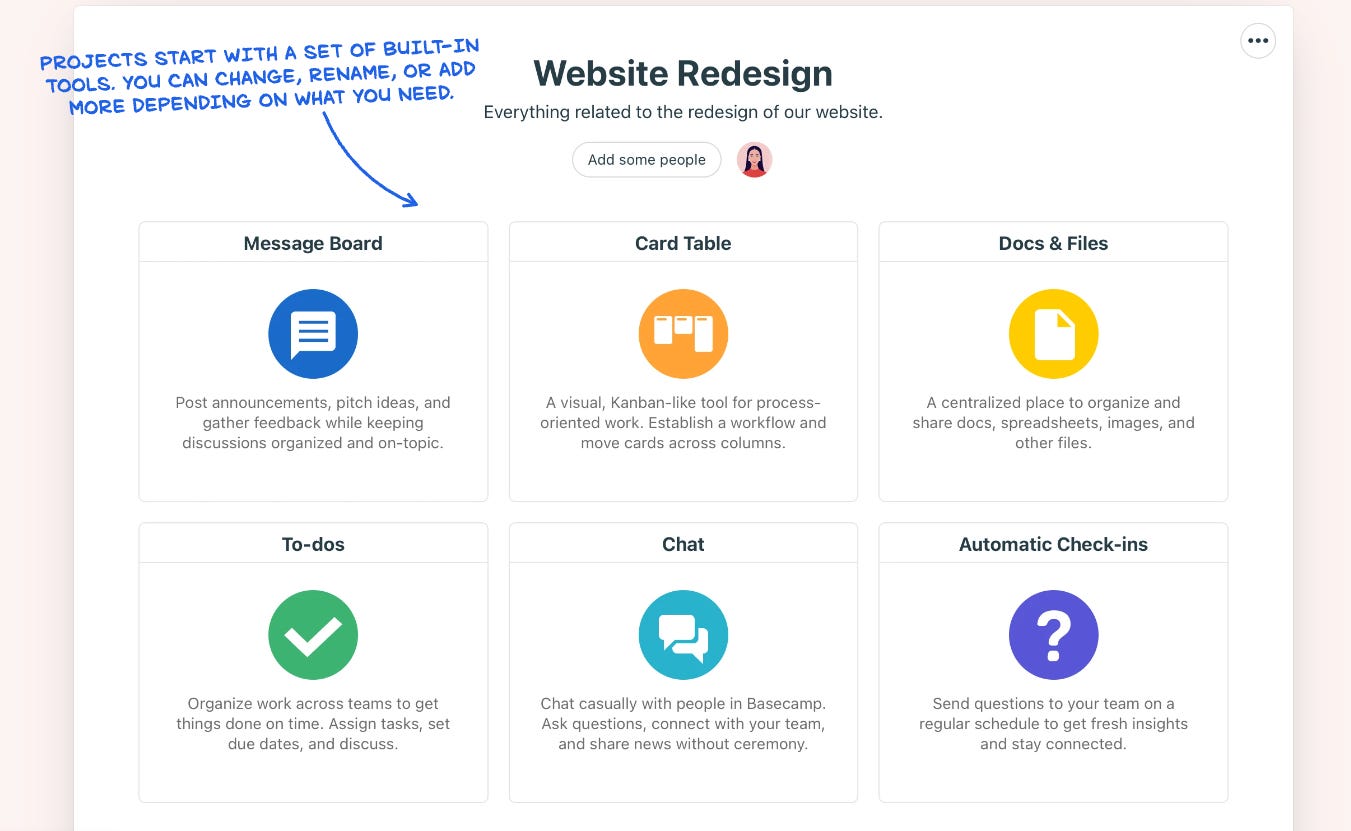
Listing out key features on the homepage helps potential customers quickly understand what your product offers.
You can easily figure out which of your most popular features are to display by:
Your own intuition - after all surely your users ask all the time about certain features
Check your support tickets/logs to see which features commonly raise inquiries
Use tools like Post Hog or Mixpanel to get accurate product insights into which features your users are interacting with the most
Source: Basecamp.com
10. Add a section for Us vs. Others
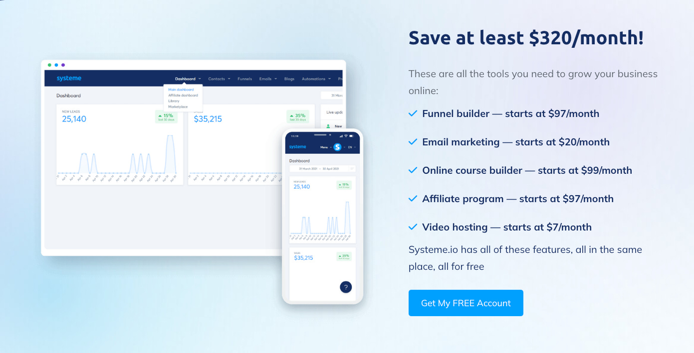
A comparison section showing how your product stacks up against competitors can nudge users toward choosing you.
I don’t recommend listing competitors by name, it looks like a cheap marketing tactic to attack them. But, if you are brining legitimate added value whether it be via included features that other tools don’t have, or the same features at a lower price point, be sure to highlight it here.
Be specific and use numbers. How many dollars are they saving? How many features are they getting that they won’t get elsewhere? The more specific your copy, the better it converts.
Source: Systeme.io
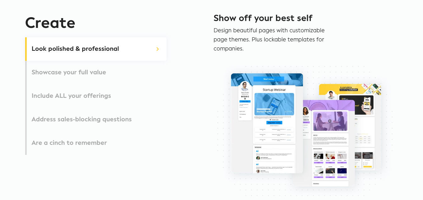
11. Include a “How it works” section or link to a page showing the same
Explaining how your product works reduces friction and confusion for new visitors. At Book Like A Boss we opted for a 3-step “How it works” section spread across 3 strips. It naturally follows the user’s journey through the product right from set up to sharing their booking page and getting booked.
Source: blab.co
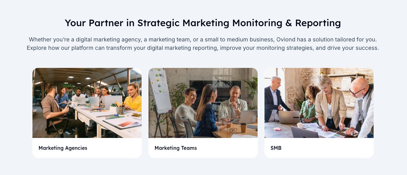
12. Showcase various personas
People want to see themselves in your product. You help prospects envision how your product will work for them by showcasing different personas that use your service.
This is a “different strokes for different folks” scenario. Make sure everyone gets the information relevant to them.
If you’re a new SaaS and are using a single landing page, then I recommend just writing 1-2 sentences of copy for each persona to describe how the tool works for them. If you have a multi-page website, then link each persona path to a dedicated landing page with unique messaging and copy for that persona.
Source: Oviond.com
13. Add a final CTA to your primary or secondary CTA
Never let a potential user leave your homepage without a clear next step. Eensures that even those who scroll to the bottom of your page have an actionable next step. This action step will typically be your primary CTA, but it’s fine to make it your secondary CTA as well.
Source: Loopedin.io
Your turn 👇
Reading an article is one thing but gathering insights and turning them into actionable tasks is another. So, I’ve done the heavy lifting for you.
Here are your next steps to measurably and noticeably increase your SaaS’ homepage signups:
Add real people and personality to your homepage to build trust
Craft a clear and compelling value proposition in your hero section
Include a CTA for a product demo or tour in your hero section
Add a clear, action-driven CTA button in your hero section
Personalize your navigation for different user personas
Include a clear primary CTA in your navigation bar
Add customer testimonials for social proof
Showcase the logos of brands you’ve worked with
Highlight key features of your product clearly on the homepage
Include a comparison section between you and your competitors
Add a “How it Works” section or link to explain your product
Showcase personas that match your target users
Add a final CTA that directs users to your primary or secondary action

