Copywriting product pages is super hard (for me). Trying to find the balance between something that hooks readers, without being cringy, while still being effective. 😔
Thankfully I could ask Indiehacker copywriting favorite, Lana Rafaela for advice on how ordinary folk can write better pages.
This interview turned into a mini master class, where she shared:
The MVP and ideal landing page
How to develop interest in your product, handle objections, and use social proof effectively
Where to adapt your page to improve your conversion rates
How to get user feedback using existing information
Here are the details:
Important note: The following is a summary written by me based on the interview, not quotes. Please listen to the audio version for the exact wording.
The ideal landing page
While each page differs by industry, a starting point to aim for could include these sections:
Hero section. Focus on the main benefits in the hero section, above the fold. That's the initial thing that people are gonna land on and that has to be really convincing to make them keep scrolling. Then talk about different objections.
Benefits. For the purpose of skimming, you should have it as a specific section. It doesn't have to be titled benefits, but they have to be clear out there. For example, using a bigger font to save time savings or ease of use or better than XYZ competitor. And then obviously infuse the rest of your landing page copy with them.
Features or how it works. You can use a video to have this if it's very verbose.
Social proof. Ideally, testimonials that give some value instead of just being trust signaling.
[Optional] FAQ. I like to use this especially if the product is not quite intuitive or if it's a new product in the space.
CTA. Try to make your CTAs unified. So don't try to sign up in one CTA and then learn more in another. If you want them to convert, then it's sign-up.
Tips:
Differentiate to earn attention. People are exposed to so much content online that you really have to do something to earn that time that they're giving you.
Develop interest via consequences. Unless people feel like they're in real pain they're probably not gonna take action. More on this below.
Respond to objections on the page. You need to know what's making your leads start to think about and second guess whether they should be really in business with you. You have to respond to those objections whether through your copy or through an FAQ section, but you have to do that.
What are the essentials?
👉 Don't have all the material to create the page above? If you want to launch with just the essentials, include:
Value proposition
Explanation of what your product does
CTA
Crafting differentiation
You need to understand the frustrations that are making people seek you out. There are a few ways to do this.
Reddit. It is a great source of unfiltered feedback. You can do some brainstorming on there as well to work out why is this product necessary.
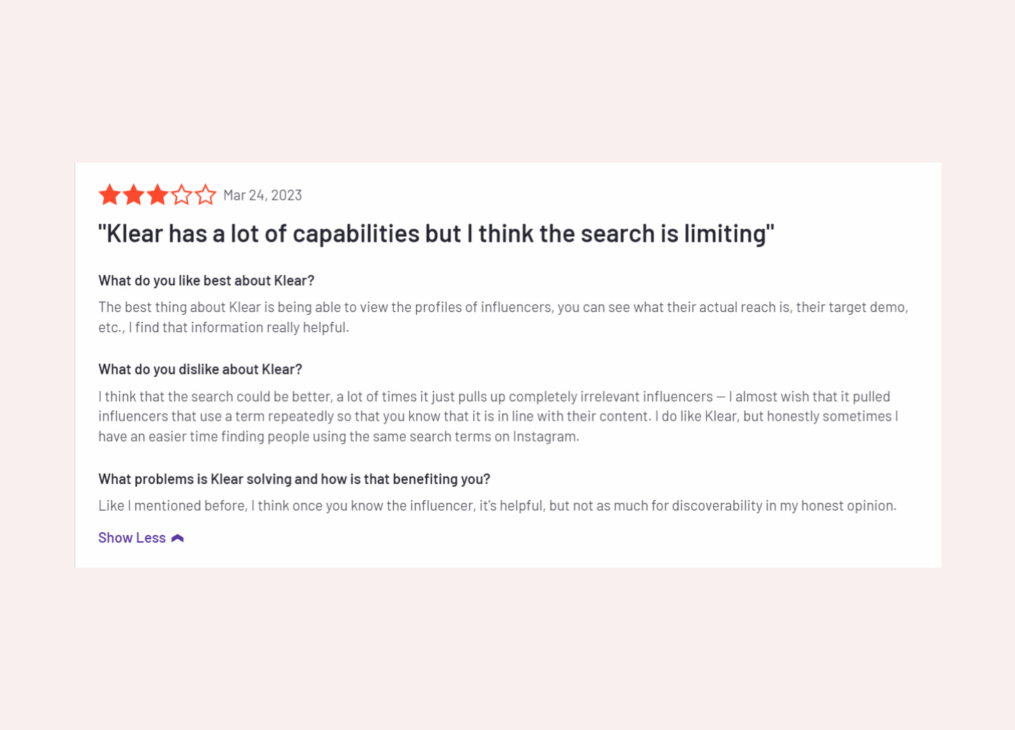
Competitor feedback. Try to find competitors on G2 and see how negative reviewers think about their products, and what words they use, and try to narrow down on a specific situation that's causing a lot of frustration. You can then replicate that and respond to that on your landing page.
Example:
Say you are building a project management tool that combines the features of Trello and Asana. From Reddit research, you discover that users are frustrated with the limited visibility of team members' tasks and progress updates which leads to a lack of accountability and confusion over who is responsible for what tasks. Following this, you decide to prioritize collaboration features and real-time updates in the tool, highlighting the benefits of increased transparency and accountability on the landing page.
How to make readers care
There are two parts to this.
The first thing is to focus on frustrations and the second is to explain how are those frustrations affecting a business. The first is the emotional stage, as we tend to make decisions with our emotions, and then we try to reason them away with logic.
👉 It is important to cover both because in B2B, you're not just convincing your immediate customers, (e.g. a sales rep), but you're also helping them convince their manager, VP etc, and that's where the second point has relevance.
Example.
If users have to waste a lot of time managing application integrations, that’s a huge frustration. But it also affects the organization’s revenue. What if integrations worked well, how would that impact revenue? This larger factor is what your VP of sales is gonna care about.
Handling objections
It depends on your sales funnel.
Let's say you want an immediate signup. In that case, you'll want to handle the majority of things on the landing page.
For other objections, like ease of use, they won't be able to see until they get started. So you have to focus users on trying the product first.
Ultimately:
Prioritize placement of objection handling. Try to understand how much people care about the specific objection and then decide where to address it. If it's something big, like pricing, integrations, or collaboration features, then you could mention it earlier on. If it's really important, address it in the hero section.
Mix n’ match objection handling locations. So I'll address the main three objections in the body copy and then I'll address the others conceptually and intuitively through the FAQ section.
It is up to you to decide what matters and what's is prevent people from trying your product in order to know which objections to address through copy.
How to explain the product
I think people tend to be too technical because a lot of founders have a technical background. I cannot fault them for that. But at the same time, you have to find the balance.
Stick to the main differentiating features. If your product is really innovative through and through, then just talk about the main features that make it different and then show a demo.
Leverage video, not just copy. I think videos and GIFs are a really good way to provide an explanation of how your product works and what it does without taking up space.
Create a curiosity gap. Tease people to want to sign up. It's like a cold email. There has to be a curiosity gap. Provide a balance of information and interest to make users want to sign up.
Definitely, use action verbs and try to make the people feel like they're using your product already.
How to properly use social proof
👉 Social proof should be contextual.
One thing that I see happen a lot is people are syndicating Twitter, G2 or Trustpilot reviews on the page, but they're not connected to use cases or specific problems.
It's just a review saying “Oh wow, I love XYZ Software!” That's good but you need to connect them to specific use cases and to specific features or benefits.
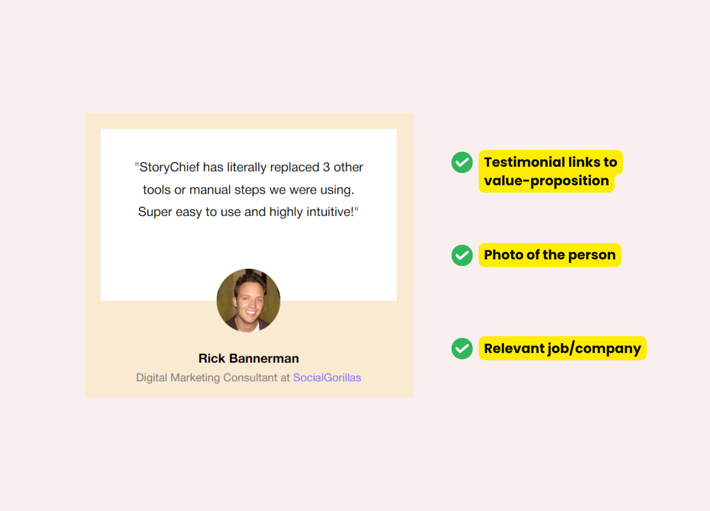
It's better to have a review saying:
“As a real estate agent, this tool has helped me increase my revenue by 30%.”Or:
“I've been able to save a lot of time that I spent on prospecting,”Also, consider adding a logo bar and media testimonials on the page.
How to get feedback
You can get feedback from your peers or friends, but I think that's not specific enough.
👉 You should really try to test it on a paying audience so an audience that pays for your competitor's products is a good testing ground.
Find them via negative reviews. I love people who leave negative reviews on my competitor's products because you're always going to be able to connect with people who dislike a product, more than people who like a product.
Connect with them on social media. LinkedIn, Twitter, Facebook groups. Try to find them on social and start a conversation.
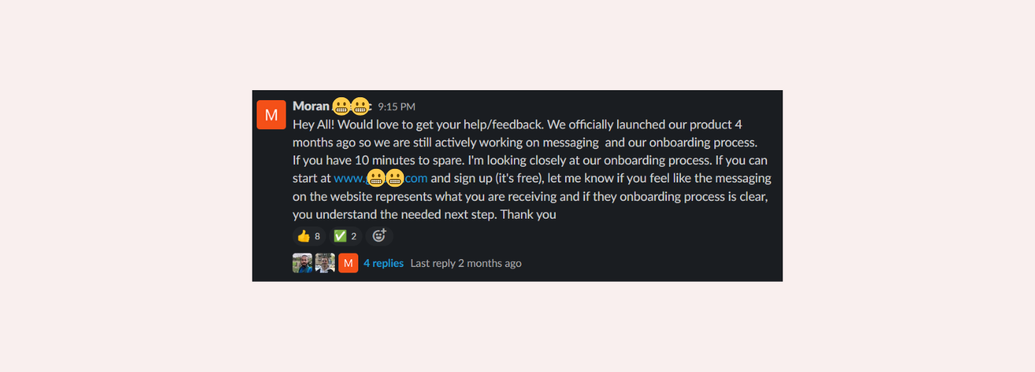
What to say:
Mention their comment and ask a very specific question.
Example:
So let's say you've seen that they've negatively reviewed your competitor and you're wondering what it is and how it's affecting them in their day-to-day. And then you can mention that you're building a product.
Break the ice before asking. It's not going to happen in one email or message. So I get a lot of cold messages from all sorts of people on Twitter. And what happens is they immediately ask for something from me. And I'm not gonna provide that unless it's copywriting advice, but that's something else. You have to start that conversation and you really have to get the engagement going and explain why you've seen their review, why you care about the review and why you want to learn more.
Try to create a mini-focus group. 5 to 10 people is enough, especially if you're just getting started. And ask them what they think about your landing page. Ask them if it means anything to them, if your language is right if they can relate to what you're saying.
Writing effective FAQs
Explain the answer as quickly as possible. Make it collapsible. Don’t take up too much real estate.
You want to make sure that that FAQ section serves different visitors with very different questions and they can find them within one or two seconds.
Get the questions that are actually relevant. Obviously, try to source them from your user interviews, but you can also use keyword research. It's also really good for finding questions in the people also ask section.
CTA Tips
👉 Make sure that the user knows what's going to happen next.
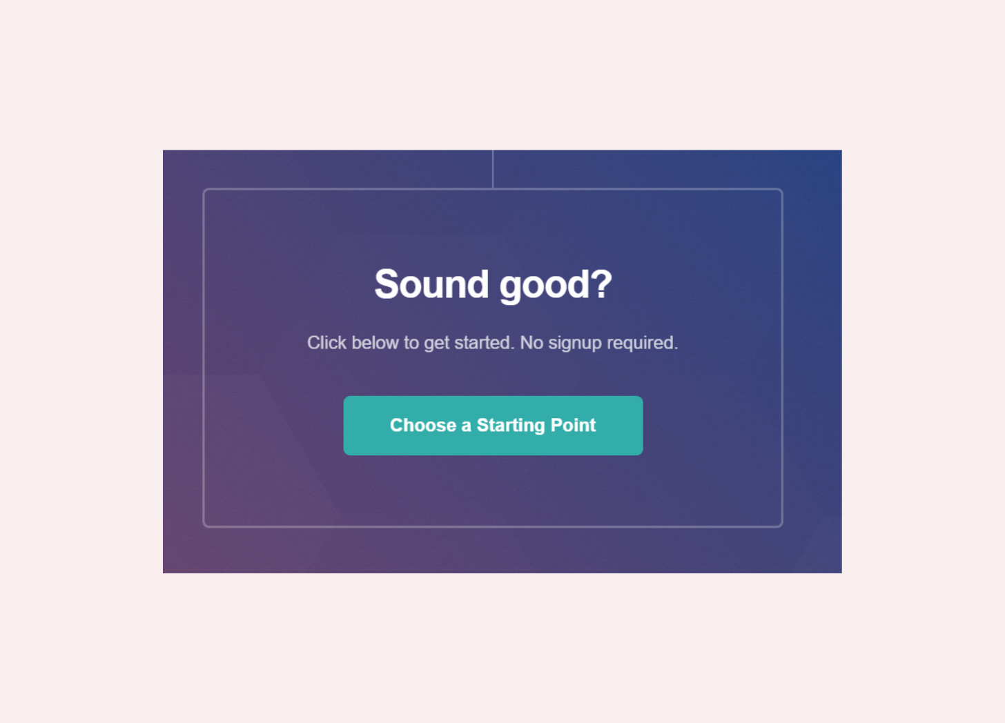
Sign up is always easiest because they're going sign up for the product. But if you're using something like Start Saving Money, then you have to make sure that all the content is around that to explain what will happen next.
Long vs short: It's not a bad thing for a CTA to be descriptive as long as it's not convoluted.
Conversion benchmarking
Personally, I don't like to aim for a specific percentage because that's really hard to do, but:
Landing pages. For a very specific landing page that is for ads, for example, it is always going to be more optimized. The average is there around 5% as a benchmark. If you already have traffic, I think 5% to 10% are really good benchmarks for your landing page. Anything above that requires further optimization and professional work.
Home page. You're going to get all sorts of traffic there, some of it is going to be qualified, some of it is not going to be qualified. The average is around 2% to 3%.
If you are a solo founder getting 5% to 10% conversion rates, you're doing great.
👉 If not, here are some ideas to improve your performance after the basics:
Start with testimonials and FAQs.
Use heatmaps to review content value. You can always use heat mapping software to see where people linger, where they scroll really quickly past when using your landing page. it helps us identify sections that maybe aren't important. Let's say maybe people scroll past your feature section like really quickly. Then it's time to ask yourself, is that section really worth it? Can I include something else?
Key links
Cherry Red Content, Lana’s content and copywriting agency
Let your customers write your copy for you by Harry Dry
Product And Brand Positioning In 3 Steps with Faisal Siddiqui
If you've discovered my marketing case studies, analyses, and interviews for the first time, please consider subscribing to be notified of the next one. Click the button below, or check out a list of my other pieces here.







Share this post